Showing posts with label miniatures. Show all posts

Thursday, May 24, 2012

Dwarves by Reaper Miniature

A Drove of Dwarves
 (OKay, so maybe eleven dwarves does not a drove make)

Recently we received a small order of dwarves, from a new customer, manufactured by Reaper.  As you well know, I love working with Reaper figures; they are detailed but not excessive.  These dwarves are a perfect example of how so much character can be built in a miniature without the need for over-the-top baubles and bits.
The following is not so much a tutorial on how I painted each figure, but why I made the choices I did.

Overall I realize that I could have gone the route of the dingy dwarf; dirty, dark, disheveled....but I'd rather reflect the Gimlis and Bruenors of the dwarf world, those that drink and fight and fight and drink, yet still remain classy <<chuckle>>.

Dwarven Brewmeister set (2+1), Nord Kegbreaker
The Dwaren Brewmeister set was cute.  The keg was already going to be a big block of brown on the figure so I wanted to balance it out with other pops of color.  Because the keg is riding on back of the one dwarf I opted to make him a bit brighter with the blue over-coat and blonde hair.  His cap, looking more like a knit than a leather or fur, is striped to add that bit of whimsy.  Serving himself a drink, the dwarf with the copper mug changes things up from the standard silver tankard.  He wears a grayed purple and green, more subdued than the keg-carrier but still enough to counter the weight of the brown keg.  In terracotta and grayed green the stand-alone-figure maintains color without being too bold.

Nord Kegbreaker also gave me a chuckle.  I didn't want him to look 'evil' with his skull adornments so I chose a bright sky blue robe with white fur trim to balance out a darker, duskier cloak.  I typically go by the rule that the longer the beard the older the dwarf so Nord must be older, therefore he gets a darker, gray beard.

I think that people make the wrong choices in how they paint because they aren't considering the balance of the figure.  Take that stand-alone with the tankard, leave his outfit the same color and imagine him with a brown beard - WRONG - that brown beard blends in too much with the hat, face, gloves, tunic - now it just looks like a brown blob.  Give him the blonde beard, just one little difference, and it separates his upper half from his lower - it makes you look at his face and the glisten of his tankard.  If you study art and painting, they teach you the same concept about paintings; that's what makes some of the greats The Greats!

________________________________________________________________________

Below, Brag Ironballs is wearing primarily chainmail - gray (or gold if you so choose).  That leaves him as a sink of gray/silver so I wanted something to balance that out, brighten it up - I chose ochre.  Another reason I chose the ochre was because I was going to give him a dark beard and hair and didn't want it to blend in.
Quimby Copperthumb needed a red beard to go with his surname.  As for his clothes I used an olive green to compliment his beard and the gray cloak is meant to neutralize.  I didn't want to go with a brownish cloak because he already has that sack over his shoulder which I wanted brown like a burlap or canvas. 
Brag Ironballs, Quimby Copperthumb, Gord Ironhead, Brock Battlebow
In the turquoise is Gord Ironhead, cloak flailing behind him.  I said I wanted to brighten things up but also keep them natural, the turquoise on Gord is bright enough so his padded vest is a neutral beige.  His cloak is burnt orange with a brown fur trim; like red, orange goes well with turquoise.  Originally the cloak was more orange and a little too bright, I washed it in chestnut in order to tune it down.
Last in the grouping is Brock Battlebow.  I'm not sure what to say about him.  Nothing really inspired me about this figure.  Nothing really leaped out and screamed "paint me this color" like a lot of figures do.  I think I went with the bright green shirt because very little of it was exposed which makes the usage of it tolerable.  All his brown leathers help to tone it down, plus I like the way green balances with red and I typically make the fletching of arrows red.  That also goes for his gem-ed belt buckle, I love red gems and the fire that they produce, so green is a good option.


 ________________________________________________________________________

There was great debate in this household about Spike the Warmaster; Bob felt that all his spikes should be metal, I thought that they should be horn/claw.  If you look closely there is actually a compromise; I painted some of them horn and some metal additions.  His armor is actually a greenish-gold color which I felt made it seem like it came from some great, horny beast to which Spike would have added more metal spikes.  What little is exposed of his tunic is bright blue, adding just enough color.

Next we have Odum Rumblebeard, the wizard.  The only thing that took thought on this figure was his potion belts; I couldn't identify anything.  Turns out there are numerous potions, some pouches, an hourglass, etc.  His robe appeared to have scales on the back and the sides looked like lizard flesh so I went with a baby, red dragon hide.  I thought that the rams head staff was very cool so I gilded its eyes and the runic symbol.  My favorite part, of course, is the scroll; I love doing little tiny detail work on scrolls and books.  This one has a glowing dwarven rune that actually fades into the back of the paper.  No, the scroll doesn't actually say anything, I mean, it is just scribble - but let me tell you - I have gotten pretty good at scribble that looks like writing. :-)

Spike the Warmaster, Odum Rumblebeard Dwarf Wizard, King Norin Silverbeard
Lastly, King Norin Silverbeard.  As his surname states, that beard must be silvery and so it is.  I think his armor is a no-brainer, he needs to be clad in kingly gold with lots of gems.  End of story.


Yes, I do usually allow the names to inspire me.  Why not?  Take advantage of something that is already available to you, the people at Reaper put those names on the package - do something with them.  This is how I make D&D characters too; I go to The Toy Soldier Gallery hobby shop in Ligonier, pick out a Reaper mini, come home and paint it and then roll the dice.  I try not to over think things, if I can help it, if I can help myself.

With Love, 
Allison
Notice the scroll.  Obviously it doesn't say anything, but I feel like it helps when I say words in my head as I'm writing - I think it influences my strokes.  Plus, I write upside down.

Sunday, April 22, 2012

Call of Cthulhu Miniatures by RAFM Miniatures Inc.

Cthulhu On the Brain

A few weeks ago I mentioned that I would be embarking on an adventure in painting some Call of Cthulhu figures for an order.  And so, a week or so ago, I finished up a portion of that order.  I also endeavored on another project that you will see at the end of the post, lets just say that I must have had Cthulhu on the brain and or failed my sanity check. 

There are a number of good visual sources out that that describe and illustrate these Cthulhu figures, but I had none of those at my disposal.  I know, I should have just read the short stories as I do have the book upstairs and for an English major that seems like the logical thing to do but I really didn't have the time.  There was an internet source that nicely used quotes from the short stories in order to describe the creatures and their habitats...but it seems that the creatures are often described vaguely.  As a writer and educator of English I see the rational on Lovecraft's vagueness - it keeps the reader imagining instead of relying heavily on writer portrayal.  Nice for the reader, not so nice for a painter.  I say not so nice for me because then my imaginings won't match-up with the visions of my purchaser...so the round-about begins, which one of us has the right vision.  Unless I'm told otherwise by the purchaser I rely on various sources, both written and visual, and my own imagination.  As for these figures, I am told by my husband that the client really enjoyed them and is happy with my paint job. 

The following images are from the finished portion of the Call of Cthulhu order:

The next four photos are of Ghouls.  I opted for a pale blue as they are primarily subterranean creatures.  Without much sunlight I presume that they might look like creatures from the deepest depths of the ocean.  The colors used were Pale Sky Blue (Vallejo) with various additions of White.  Their hooves are Black with a highlight of Red Tail Light (Vallejo).


These four photos are the various accoutrements that accompany the figures; random gravestones, sarcophagi, and markers.  Nothing elaborate about them, standard grays.


The cylinder on the far right is the Brain Cylinder that goes with the two Mi-Go figures.

Mi-Go are said to be fungoid, fleshy pink, and crustacean.  Wow, talk about confusing.  I was thinking about most lobsters and shrimp plus I thought about some of the odder fungus out there that have an unusual flesh color almost pink.  So, I went with various shades of Vermillion (CelVinyl) with numerous additions of White and made their fleshy brain-like heads more pale pink than their crustacean carapace.  The tentacles are actually the same color as the head with the addition of Levathian Purple wash (GW) which I bled up into the underside of the convulsions of the brain/head.  If you look closely at the wings, the spines are black but I surrounded them in the purple wash so that they related back to the head.
The guy in the trench coat is actually another Ghoul.

Deep, aquatic, often pale green or pale blue with white bellies...has to be the Deep Ones.  These fish-like, frog-like creatures were interesting to paint.  I wanted them to look as if they were, again, subterranean and saw very little light, but I didn't want them to look too much like the Ghouls.  They are painted with Highlands Moss with a wet brush of Pale Lichen (both from Reaper).  Around the raised scales of some of the Deep Ones is the addition of a wash called Algae.   Their bellies are various stages of diluted Creamy Ivory and White and their eyes are Antique Gold.

Humanoid aberrations these Ghasts and Dimensional Shamblers are kinda creepy.  Many people painted their Ghasts in a dark green with skull white heads which look really cool but I just couldn't picture them that way so I went with a stripped-of-flesh look especially since it appears that they have no lips with which to hide that horrid grin.  The Ghasts are painted in Antique Rose and Porcelain Pink (both of Reaper) with a placed wash of Ogryn Flesh (GW).
With their hanging flesh and exposed bones I felt as if the Dimensional Shamblers needed to resemble rotting, decaying, putrefied flesh.  Ghoul Skin, Moldy Skin and Bloodless Skin from Reaper did an adequate job on the third from the left.  The raised bumps are painted in pinks and washed with purple to mimic boils and pustules.  I also looked up gangrene and skin rot in order to get some of these colors close.  Those are some pretty cool looking pictures of spider bites and infected wounds - just sayin.
Let the madness ensue with The King In Yellow!  Obviously, he's yellow, Ochre 11 (CelVinyl) with a highlight of Yellow 16 (CelVinyl).  His mask is Chainmail and Mithril Silver (GW).  The little fleshy is painted in Golden Flesh and Golden Flesh Highlight from Reaper.

The Proto-Shoggoth was a dilemma.  Originally when I looked at another paint-job of him it appeared as if his hands and feet were tinted blue-green and his flesh was almost human.  The more I looked at the figure the more I realized that those were vines with what appear to be stones and his head is like a seed pod.  "Golly," says I and I was back on track, "he's like a plant golem."  Coolness.  So, he is fleshy, Fair Skin and Fair Highlight (Reaper) with placed Ogryn Flesh wash (GW).  The stones are simply washed with Devlen Mud (GW) and his vines are painted Olive Green (CV) with a highlight of Olive Drab (CV), then finally washed with Deep Olive wash.


Painted in Creamy Ivory and highlighted in White with two washes, one of Baal Red and Algae Green, the Giant Worm protrudes from the ground.  I wanted it to look other-worldy instead of like a typical earthworm.

 
The Shugoran was an interesting piece.  I really wasn't sure where to go with it until I saw a couple online images that showed him with a red protuberance and another that had him with blue skin.  I decided to make the two work together and here is what I came up with.  Sky Blue skin with additions of White, washed in Sapphire wash.  Hands and protuberance are Red (Vallejo), Red (CV), Vermillion (CV) and Orange Yellow (CV). 
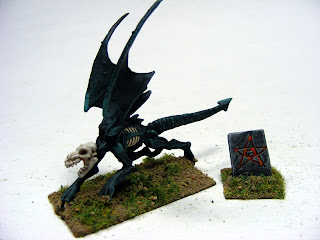
As for the Hunting Horror, well there is an online image that I just couldn't resist.  His body is Bone Shadow and Polished Bone (both of Reaper).  His wings are Red Tail Light (Vallejo), Red (Vallejo) and Red (CV).
Next we have The Hound...

It is initially painted black and then highlighted with Deep Sea from Vallejo and accented in places with Deep Sea lightened with white in various stages.  I wanted it to look as if it was glowing.  The skull head and ribcage are painted Stained Ivory with a Creamy Ivory highlight.

The Yig...well that was easy, paint him like a cobra. 
His body is Brown, Light Brown (both of CV) and washed in Devlan Mud (GW).  The stripes are Badab Black wash.
The cobra design on the back is Black with White.  Simple.  His belly is Ochre 11 with a Creamy Ivory dry brush.
 
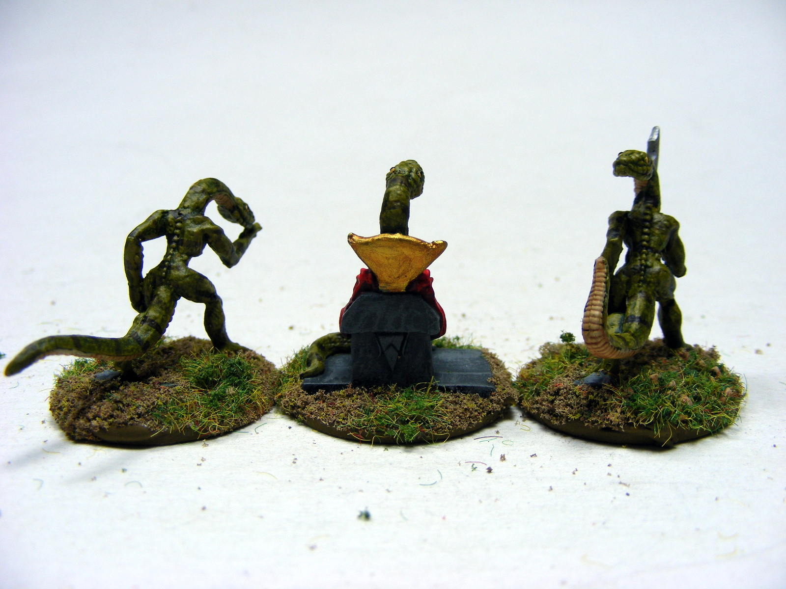
Serpent Men...boy are these figures tiny.  But they are fun to paint.  They are Middlestone from Vallejo with a Deep Olive wash.  Their stripes are Devlan Mud wash and their bellies are Yellow Ochre 11 with a Gryphonne Sepia wash.
 The figure in the center's cloak is Red (Vallejo), Red (CV) and Vermillion (CV).
Being that they're supposed to be cannibalistic tribal peoples, I decided that the Tcho-Tcho would be darker complected.  I wasn't sure about the "hair" that their wearing as the written descriptions of them say they are hairless.  <<shrug>>  So...I assumed that the "hair" is false like a headdress.  I went with the white because it reminded me of ceremonial dressings where they adorn themselves with white clay. 

Bob said he wants a Great Race of Yith for our backyard to scare away the kids.  With my skills in welding I think I might be able to pull off a pretty large statue. 
I took my inspiration from a few written descriptions as well as images from the web.  His body is primarily Ochre 11 with a Creamy Ivory dry brush, washed with Burnt Umber wash.  The claws are Sunflesh (CV) highlighted in Orange Yellow (CV) and the dots are Vermillion (CV) with Baal Red wash.  Up front, the flower shaped bell is Red with Vermillion highlight and washed in Baal Red.  His head is Green (CV) with a highlight of Lemon Yellow (CV).  You may notice that each part blends into the limb.  That was just a matter of running the part color down a little and then dry brushing the body/limb color, Ochre 11, on top of it and washing with the Burnt Umber wash.
As Sand Dwellers I assumed they were kinda sand colored...therefore they are painted with Sand Yellow and washed in Gryphonne Sepia or Burnt Umber wash...I can't remember which.

Lastly are these little doo-dads....yep...
 

Cthulhu On the Brain 

or How I Failed My Sanity Check... 


No, not really, I just wanted to make a Cthulhu cap...I saw photos of one online but never saw directions.  I figured, "How hard could it be?"  Well, it isn't really.  This one is now in the care of a young friend of mine who adores hats of all kinds, I'm sure she is proudly wearing it as I type.  I made another Cthulhu Cap this morning before painting some Blood Bowl Dwarves...Oh but that is another adventure for another time. ;-)
With Love, Allison Chicka

Tuesday, March 20, 2012

Grenadier Red Dragon

Soooo...nope, haven't finished posting about the GW Spider or even the final photos for the two versions of the Wendigo, but here I am posting about a red dragon and the paint job.

Sorry for my inconsistency, I've been busy.  For a while I was doing a long-term substitute position at a local school, then I had to get ready for the HMGS East, Cold Wars convention.  Bob and I were busting out butts to get ready for that con and now we're busting our butts to get orders done that should have been done prior to Cold Wars.  Aargh!  It's nice to be busy, don't get me wrong, but that leaves little time for other things, like blogging.

This Grenadier Red Dragon is part of a larger order of miscellaneous TSR AD&D miniatures.  Frankly, those minis are pretty cool and I'm excited to see if I can put a spiffy paint job on such, how to say it politely, roughly sculpted minis.  I'll make sure I post those TSR miniatures as a whole when I get them all finished.  Unfortunately I didn't have the time and luxury of taking photos as I was working through the steps, sorry.

My inspiration for this red dragon is from the AD&D cover art:

Body Scales
Here you can see how the Yellow Orange is most noticeable nearest the belly scales.  It is also on the hindquarters, shoulders and spine to give it a flame-like glow.

First, I base coated the dragon with Vallejo Red except for the belly scales and the wings.  I did the wings last because I knew I'd be bumping and handling them during the painting process and obviously the belly is done in an entirely different color.

Second, I dry brushed on a coat of Cel-Vinyl Red, making sure that some of the darker Vallejo Red was still showing beneath the round scales.

Next, I lightly dry brushed on Cel-Vinyl Vermillion.  I didn't want to cover up the Red entirely, but the Vermillion really makes things pop.  You'll notice that the difference between the Red and Vermillion is very subtle, if you feel like omitting the above Cel-Vinyl Red step, so be it.

Lastly, I dry brushed on, with a very gentle hand, Cel-Vinyl Yellow Orange.  Again, this is to make things glow and pop.  In most cases I only got close to the belly scales and a little on the higher points like the shoulders or top of the back scales.

Belly Scales
This part is easy because it uses only two colors.
When you dry brush, the Ochre 11 will only end up on the edges of the belly scales.

First, paint on Cel-Vinyl Ochre.

Second, dry brush on Cel-Vinyl Ochre 11.

Done.

Wings
I wanted the wings to be a little lighter than the body because I want them to appear translucent or thin and leathery like the membrane on flying lizards.  Since one can't (or at least I can't) make them appear truly translucent making them lighter is the best way I know how.  However, I kept the bone areas of the wings darker like the rest of the body.

First, paint the membranes of the wings with Cel-Vinyl Red.

Second, paint the bone areas with Vallejo Red.

Next, dry brush the bone areas with Cel-Vinyl Red.
Notice how the Yellow Orange is really only pronounced on the scalloped edges of the wings.

Then, dry brush the entire wing with Cel-Vinyl Vermillion.  Make sure on the membranes that you apply a heavier hand when dry brushing at the scalloped end of the wings (on both sides) to make it appear thinner.

Finally, dry brush, very lightly, the Cel-Vinyl Yellow Orange.  You can do this all over, even on the bone parts but make sure that you hit the scalloped ends of the membrane to emphasize the thinness. 

Claws
This is pretty much the way I do all claws or horns.  I have some other variations, most take more steps.  This is a quick one with pretty good results. I do this for teeth a lot of the time, too.

First, paint the claws and horns Reaper Stained Ivory.

Second, using a very small brush like a 10/0 or 18/0, apply strokes of Reaper Creamy Ivory that begin at the pointed end of the claw and end sharply at the base.

Then, apply white in the same manner as the Creamy Ivory only this time do so in a smaller fashion so that really only the tip of the claw is pure white. 

Finally, after it has dried, using a small brush apply GW Devlan Mud wash to the base of the horn/claw right near the flesh.

Eyes
They are simply GW Burnished Gold with a black pupil.  I also used a little GW Badab Black wash around the eye in the socket to make it stand out.  You could paint the eye and socket with black prior to applying the Gold, I do that frequently.

Tongue
First, paint the tongue with Reaper Antique Rose.
Then, paint only on the ridge points, Reaper Porcelain Rose.

And, well, that's it for the dragon!

Red Dragon Shrine

There is also that odd dragon shrine kinda thingy.  Bob has a Tiamat mini and it has the same shrine.  I never knew what to do with it but this time I decided to give it some color instead of leaving it strictly gray stone.  Looking at the sides of the shrine it has these odd cobra designs so I went with an Egyptian feel by painting them in instead of leaving them carvings.  Personally I think it adds some punch to an otherwise dull piece.  Additionally there are the incised letters/symbols on the front and back and the words Red Dragon on the base.  I suppose I could have used "green stuff" to fill in the words Red Dragon but Bob simply suggested that I fill the incised letters with gold.

First, paint the entire piece with Reaper Shadowed Stone.

Second, dry brush it with Reaper Stone Gray.

Third, dry brush lightly with Reaper Weathered Stone.

Fourth, using a small detail brush paint the cobra design with Vallejo Red and Cel-Vinyl Vermillion.  Also paint the 'tail' of the cobra on the base with Vallejo Red. 

Fifth, paint the belly of the cobra design with Cel-Vinyl Ochre.

Lastly, paint the teeth/fangs white and the eyes gold.


The Tail of the Cobra on the base:
To make belly scales on the tail of the cobra, use black to paint a long rectangle that starts at the base of the cobra belly design and curves into the base.  Using a detail brush paint smaller rectangles of ochre onto the rectangle of black.  Leave slivers of black between each ochre rectangles, this gives the impression of belly scales without too much effort.  The ochre rectangles were also highlighted by painting a dash of ochre 11 onto them.

Then, to mimic scales, make small dots of Vermillion near the belly scales, and dots of Cel-Vinyl Red further away.  You could add the Yellow-Orange nearest the belly scales but I thought that would be over-kill.

Well, that's all it takes for this piece and the shrine.  Enjoy!