Showing posts with label Evil Bob's. Show all posts

Sunday, September 18, 2011

Along Came a Spider Part 2 - GW Arachnarok Spider

So the other day I posted what was the beginning of this adventure to slay the beast that is Arachnarok.  Okay, so maybe it's not an adventure and maybe I'm not actually slaying anything, but lately it feels like it.  Onward and upward, or at least forward, perhaps downward, maybe sideways - at least not backwards.

I'm making progress but it is slow going due to all the legs getting in the way, and I finally did break off one of the scaffolding parts like I thought I would.  I warned you, be careful.  Even I, who was ever cautious, managed to bust off a piece.  Bob didn't find it amusing.

Now here's some more of my progress...however, I'm not finished yet.

At last post, the carapace was done.  I was working on highlighting the abdomen, painting the rigging, and beginning the legs.

The Abdomen
Paints Used:
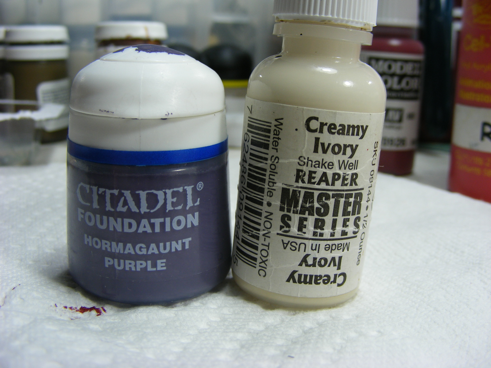
When I mix paints I usually make up a card, like this one, to remind me how the colors I made are supposed to appear.  So now you see the transition between the original Hormagaunt Purple with the mixture of Creamy Ivory.

Process/Techniques:
Last post I had only base-coated and applied the first highlight.  This time I went back and added the final highlight by using a mixture of the Hormagaunt Purple and Creamy Ivory.  I can't give you a percentage per say but I can say that it is mostly Creamy Ivory with a touch of Hormagaunt Purple.  If you go to mix it you will find that the purple is very strong and it takes very little to make the ivory purplish.  I'd say a 2:1 ratio of Ivory to Purple, almost a 3:1.
Basic application is a pseudo-Dallimore method over the other, middle, highlight.  Only this time you can create additional creases and separate some of the bulbous folds into smaller bulbs.  For example, check out near the back two stingers in the picture below.  All those little lines provide depth and create the creases or folds. 

Spider Babies and Egg Sacks
Paints Used:
Spider Babies
Egg Sacks


Process/Techniques:
The Spider Babies will eventually look just like their mama.  So far I've painted them solid Model Color Red and washed them with Badab Black.  Eventually they will be detailed with Red and Orange Yellow; however, not so detailed as their mother.
As for the Egg Sacks, I wanted them to stand out a little from the creamy purple abdomen.  At first I thought I wanted a sickly green, almost nasal infection green.  Yeah, you know which green I mean.  However, after careful consideration I felt that that would look a bit off so I chose a more muted sickly green with the Undead Triad from Reaper Master Series.  The egg sacks are simply painted with the base color of Ghoul Skin, highlighted with Moldy Skin, and a final dot of Bloodless Skin.  They will probably be glossed in the final product to give them a wet appearance, as if they are about to burst.


Webs
Paints Used:

Process/Techniques:
So far, only the base color has been applied to the webs and they will be washed with Devlan Mud in order to bring out all the tiny strands.  After that I will either dry-brush or carefully paint each strand with Polished Bone.  I'm sure I'll be holding my breath a lot for that one.


Scaffold
Paints Used:

Process/Techniques:
I simply painted the scaffolding with the Wood Gray and then dry-brushed on a highlight of Grayed Orange Yellow.  The "cut" ends of the scaffold that appear to be spear-like are painted Grayed Orange Yellow and will eventually be detailed in Stained Ivory and Creamy Ivory.  I'll show more of that when I finally do it, which won't be until the end. The log at the back of the spider is colored exactly the same way as the scaffold.

Next up: Along Came a Spider Part 3 - finish the scaffold, the log, the legs, and begin the horns/spines.
BTW - I'm waiting on doing those spines/horns because they are good gripping points for my fingers.

Friday, September 16, 2011

Along Came a Spider Part 1 - GW Arachnarok Spider

If you are feeling intimidated by this spider, you should be.  Not because you have a fear of them, but simply because it is daunting to assemble and paint.  Never fear!  I'm here to give a few suggestions that might help squash your spider troubles. 

Bob assembled the spider and found that it took him over two hours because the schematics are rather poorly put together.  He suggests reading the full schematics first, then dry-fit assemble prior to actually trying to glue.
Another suggestion is this, perhaps painting it on the sprue is a better idea than fully assembling prior to painting.  That way all you would have to do is touch-up where you cut off the sprue and where the glue left a residue.  Right now I'm having difficulty in doing the detail work between the many legs and the scaffolding rig.  The pieces that jut out from the main body not only get into the way of the paintbrush but also mess with my depth perception and I have found my brush going astray on many occasions.

*Note: These directions seem out of order, they are grouped by the body part of the spider but follow the STEPS if you really choose to paint in the order that I did.  This order was done for ease of painting.


Main Body Colors for Carapace:
First let's start with the paints that I used...

Base-coat: of Model Color Red.  Let dry thoroughly, may take two coats.  Do not dilute with water unless your paint appears to be too thick.
Washes: Citadel Badab Black and Leviathan Purple.  Used over the base-coat to go into the crevices and darken chosen areas.
Highlights: Cel-Vinyl Red and then Orange Yellow.

Techniques/Process...
Step1 - After the initial base-coat I darkened the very top of the body, the face, and the portions of the collar above the head with the Badab black.  Before the black dried too much, I used the Leviathan Purple around the edges of the black and bled it into what was left of the red at the edges of the carapace.  You'll see that it nicely darkens the crevices as well as all the little bumps, horns, and spines on the carapace.  Let this dry thoroughly.
Step 3 - The tricky part.  See Step 3 image(s).  This takes a very steady hand and don't let the legs get in the way or you'll find you're making squiggly lines.  I suggest taking deep breaths and holding it as you make lines.  I'm considering becoming a pearl diver in the orient when I'm done painting. I typically brace my painting hand at the wrist with my opposite hand as I do the edging lines.
Use the Cel-Vinyl Red to make the first highlight.  Go over all edges, all bumps, and around the horns/spines.  Again, take note on the box art.  You'll notice that there are also triangular accent marks that come down off the edges of the carapace, see note under picture.  I used a 10/0 brush to do all these details.  You may need to thin your CV Red just a little to keep it flowing, the red tends to be/get sticky and you won't have smooth lines. 
Then, after the Red highlights have dried, use the Cel-Vinyl Orange Yellow to add extra dimension.  Lightly go over the red highlights.  Attempt to do so thinly.  If your lines appear intermittent, that's okay, it'll look a little more natural than a perfect accent highlight.
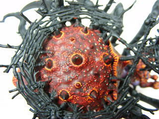
STEP 3.  Also, notice how the black and purple wash help to detail the carapace.  However, the wash isn't the ultimate fix.  Unfortunately, the model's details are too smooth to take a wash very effectively.  So, if you were hoping to base-coat this monster and simply wash it; you're in for a let-down.
STEP 3.  Highlight all the bumps and around the horns/spines in Red and then with Orange Yellow.
Triangular accent highlights.  TIP: Basically, when I could, I held the figure with the ass-end up and drug my paintbrush from the edge toward the center giving the greatest amount of pressure when I started and letting off when I finished the stroke in order to create the triangle effect.  Sometimes I works perfectly, sometimes it doesn't, don't be discouraged.
 TIP: I suggest doing doodles using the 10/0 brush with paint on sheets of paper.  Hold the brush up further on the handle and wave it like a wand using only the dexterity of your fingers to do the moving.  Or, think of it as a pen or pencil instead of a brush, write with it, do cursive and feel the flow of the brush.  Play around with creating wider/heavier strokes by putting weight on the brush and then letting off to create a thin tail.  Create a simple images of animals or shapes.  I liken this to Japanese Calligraphy using the subtle movements of the fingers and even wrist to glide the brush.  You may gain dexterity and brush control by doing this, even practice with a calligraphy kit seems to help.

Abdominal Colors:
Here are the only two colors...

Base-coat: Citadel Hormagaunt Purple
Highlight: Citadel Hormagaunt Purple + Reaper Creamy Ivory = a pale, creamy purple.
2nd Highlight: Reaper Creamy Ivory


Techniques/Process...
Step 2 - Paint the abdomen underneath.  I suggest looking at the box art to see where the abdomen ends and the carapace begins (If you care).  Use the Hormagaunt Purple from Citadel straight out of the jar and base-coat.  The foundation paints are rather thick, so if you find yours not speading well, dilute lightly with water or add a retarder like Liquitex Slow-Dri.
Step 4 - Highlight the abdomen.  Mix the Hormagaunt Purple with the Creamy Ivory until you get a pale, creamy purple color.  Apply this pseudo-Dallimore style over all the high bumpy parts and high ridges of the fleshy part of the spider's abdomen.  See image Step 4 below.
Step 5 - I have yet to do step 5 on this model; however, it will involve a final highlight with the Creamy Ivory over the raised bumps and high ridges of flesh. 
STEP 4
STEP 4

Eyes:
Colors used...

Base-coat: Black (any kind)
Highlight: Citadel Necron Abyss
2nd Highlight: GW Ultramarines Blue
3rd Highlight: Model Color Deep Sky Blue
4th Highlight: White (any kind)
*Note: after a spray varnish coat when the model is complete, a gloss varnish will be applied to the eyes.

Techniques/Process...
The eyes can be done at any point in the process, however I was feeling bogged down by the highlighting of the carapace and wanted to see progress so I painted the eyes. See Eye Image.
  • First, paint the eyes black.
  • On lower half of eye apply Necron Abyss.  It will be rounded on the top; follow the contour of the eye.
  • Next, apply a comma-like swish to the bottom of the eye using Ultramarines Blue.
  • Then, apply a tinier comma-like swish using the Deep Sky Blue on top of the Ultramarines Blue.
  • Finally, apply a dot and curved dash of White at the top of the eye in the Black portion.
Eye: Notice the shapes that create the eye.


"Along Came a Spider Part 2" will be coming shortly.  If I don't explode my lungs first.

Be 100% careful about accidentally bending the back legs attached to the fallen log and with the scaffolding on the body.  Again, this is why I'm thinking it would have been advantageous to paint then assemble or perhaps do some assembly, paint, and fully assemble.  Hey, live and learn.
Love - Allison Chicka

Wednesday, August 3, 2011

First Batch of Reapers Finished

Based and Ready to be Shipped to an Anxious Customer!
   You've  already seen most of these figures, if not all of them, prior to their basing.  I always feel that figures aren't complete until they have proper terrain to stand upon.  There is something about green that complements the figure.  I always say that it's a decorator's trick or a butcher's trick.  Decorator's trick: in order to join rooms of different colors you use plants in each of the rooms.  Butcher's trick: in order to make your meat appear redder and more appealing, add green paper backing or that weird green foliage to the butcher's case.  In addition, the base of the figure changes the mood of the figure.  For instance, below in the first picture, the female necromancer; imagine her on a sparse base with no foliage, just charred rocky debris.  It would seem desolate and foreboding; which would work equally as well as the sparse grass.  The sparse grass just doesn't seem as gloomy and I happen to enjoy how it makes the green in her staff and the green of the skeletons pop.
   So one word of advice, "If you are ever a titch dissatisfied with a paint job; wait until you base it and see how you feel."  The black of the stick or base you've been painting on is actually sucking the color out of the figure.  It's an optical illusion, like when they suggest wearing black to make you look thinner.  Dark colors make things look smaller but they also wash the color out of what they come in contact with.


I like how the blue on the marid has become so brilliant now that the green of the base is there to compliment.  And I know, she is a water genie, why isn't she on a water base?  Well, she could have been, but for continuity's sake she is on grass like all others.


I bet the first criticism here will be, "They're tavern people, they should have tavern bases!"  I agree, however, let's pretend that they are in a biergarten.  Always remember, if a person ever wants a particular base for a figure, all they have to do is mention it in their order and we'll do the best we can.  Otherwise, we err on the side of continuity.  It is no cop-out, just the uniformity of the figures in relation to other figures when in game play.


Basing for figures such as the center half-ogre can be difficult sometimes.  He comes on his wooden plank base, appropriate for a pirate but then what.  So, you can only use him in a tavern or a ship?  It may seem cheezy but we added the earth and turf to kind of camouflage the boards and make him more applicable to general adventuring.


I hate having to paint figures that I like.  They are like children; I give them a little bit of life and I don't want to let them go when the time comes.  I looked at Bob the other day and said with a pouty face, "Do I really have to send them?"  He of course said, "Yes" and laughed at me.  But, now you also know that I put a lot of love into what I do.

Wednesday, July 13, 2011

Gnomy Monday

 I was extremely excited to begin painting these Gnome Reaper figures.  I think they are simply adorable and so well sculpted; personality just oozes from these figures.
So, let us talk inspiration.  Of course I perused the D&D players handbook in the gnome section for what they typically look like and wear...that was good.  I didn't have to do that, I just chose to.  With that said, D&D reports that gnomes are brownish skinned with fair hair and blue eyes; they enjoy to wear earth colors and like adornments on their clothing and gems.  Yeah, I know, I sound like gnomes are real.  But, what if they are?  We wouldn't want to insult them.

Here are the three gnomes I worked on:
 Cassie

She has straw colored hair and very light blue-gray eyes.  Went with gold accents on neutral/natural colors.  Wanting her staff to stand out, I kept it black and made the gems a bold red.  My favorite part is the set of keys in her braid at the back. ;-)


Marius Burrowell
This gnome has character to spare!  His face is so full of gesture.  Because gnomes are so compact, I wanted to keep things very simple and keep the colors to a minimum.  I think the key in smaller proportioned figures is to pick a couple objects and make them stand out and keep the others rather subdued.

 Corim
I love the devilish brilliance in his eyes so I made them a bright blue in the same color as his sash.  The spiked shape of his collar prompted me to choose a earthy red for his shirt.  Again, keeping it simple I chose a grayed-orange yellow for his pants and dark brown for boots.  All the focal point should be in his eyes and magical feat.  I am considering adding a little sparkle to his flames...not sure yet.